You might spend a great deal of time and effort in planning your affiliate marketing campaign, hashing out everything to the smallest detail. But creating a successful marketing funnel would not be possible without a good landing page. If designed well, a landing page can be the key to getting more visitors and more clicks. To help you in this endeavor, we’re here with some great affiliate marketing landing page examples to inspire your own affiliate marketing campaigns.
We understand that creating a good affiliate marketing landing page is no easy feat. It leaves many affiliate marketers wondering –
- How can I create an affiliate landing page that instantly catches the attention of the prospects?
- How many types of landing pages are there? Is a landing page the same as a squeeze page in affiliate marketing?
- Which type of landing page should I create for my affiliate marketing niche?
- What can I do with the affiliate landing page to provide the prospects more value?
- How do I pitch my product/service through the landing page without coming off as salesy?
In the following sections, we’ll try to answer all these questions. We’ll explore the various types of affiliate landing pages while taking you through some excellent examples for each. We will also guide you through the process of structuring an effective affiliate marketing landing page with the help of an AI landing page generator.
TL;DR Here’s a quick video summarizing the key points of this post.
- What is an affiliate marketing landing page?
- Why are landing pages necessary for affiliate marketing?
- Types of affiliate landing pages + Affiliate marketing landing page examples
- 1. Lead capture landing page
- 2. Squeeze page
- 3. Click-through landing page
- 4. Splash page
- 5. Microsite
- 6. Sales page
- 7. Viral landing pages
- 8. Infomercial
- What is the best way to create landing pages for affiliate marketing? Useful Tips for Affiliate Marketers

What is an affiliate marketing landing page?
An affiliate landing page is essentially a web page that is created specifically for an affiliate marketing campaign. When prospects click on a link in a digital ad, affiliate marketing blog, or your affiliate marketing YouTube channel, they are redirected to this landing page, which contains the actual affiliate offer you are trying to provide.
The traffic to affiliate marketing landing pages can be generated through paid ads, newsletters, social media, or even organic traffic sources. The purpose of all landing pages remains the same – driving the leads to take action.
An AI content assistant can be really helpful for creating these landing pages. Narrato AI’s landing page generator can create a keyword-optimized landing page copy that perfectly highlights your affiliate product or service’s unique selling points. It allows you to customize your landing pages to match your target audience effortlessly.

AI landing page generator
Besides that, the AI copywriter offers more than 100 unique AI micro tools and templates to assist with all sorts of copy and content creation needs.

Narrato AI copywriter
Looking for a product description? There is an AI product description generator. Need a blog post? The AI blog writer has you covered. You’ll find an AI template for all your content creation needs on Narrato.
The platform also has an AI Content Genie that can effortlessly craft social media and blog content for your affiliate marketing campaigns on autopilot.
What is the difference between a bridge page and a landing page?
Many marketers get confused between bridge pages and landing pages. A bridge page is essentially a type of landing page that connects your prospects from one landing page to another. It is great for capturing the interest of the audience and also helps in increasing the click-through rate.
Why are landing pages necessary for affiliate marketing?
According to a Marketing Sherpa report, almost 48% of digital marketers prefer to generate a fresh landing page for every marketing campaign. If so many affiliate marketers are behind this strategy, there’s certainly some value in building affiliate landing pages along with your affiliate marketing content.
In the digital space, we as marketers are always competing for our audience’s attention. When a potential customer comes across an affiliate link, you would have less than a few seconds to pitch for an affiliate product. A well-designed landing page can be just the thing to help you capture the prospect’s attention and get them to convert.
Here’s why you should invest some time in making a landing page for every affiliate marketing campaign –
1. Lure the target audience to try a product/service: Besides trying out different types of content for affiliate marketing, it’s also useful to spend some time creating dedicated landing pages for every marketing campaign. You can use the landing page to attract the target audience with a vibrant design, enticing offers, and a strong CTA.
2. Limited distractions: The visitor reaching the landing page is already interested in the product/service you are offering. When they are presented with a clear action button and lesser distractions, they are more likely to convert.
3. Lead generation: As we’ve already stated, affiliate landing pages can be very useful in lead generation. They can help you drive more promising leads to your affiliate offers. After obtaining the leads, you can segment and nurture them to increase your chances of making an affiliate sale. Now, you might be thinking – how do you nurture these leads? Well, the most obvious way to do it is by email outreach campaigns and timely follow-ups. You can also retarget with a more personalized landing page (dedicated to a market segment).
4. Collecting the prospects’ demographic information: Whenever a user visits your landing page, their demographic information also gets recorded. An analytics tool like Hotjar or Smartlook can be used to study this information to gain more clarity about the people visiting your profile and how many of them are converting. Ensure to use email verification tools to confirm the validity of user’s details by verifying email addresses they provide, as well as an email warmup service to avoid landing in their spam folder. This data will also help you in determining better ways of targeting them.
5. Finding new affiliate opportunities: Creating landing pages can be especially useful for affiliate marketers that are just starting out. When an affiliate manager comes across a well-designed and optimized affiliate landing page, they are more likely to reach out to you with an affiliate opportunity. So, creating affiliate marketing landing pages will help in establishing a professional brand image.
Before you publish your landing pages or during updates, valuable recommendations on the potential impact your copy may have, can help you make improvements proactively. Typeface, an enterprise generative AI marketing platform, offers instant feedback on how your content resonates with your target audience and matches the brand voice you use for all your marketing collateral. It also provides actionable suggestions to enhance landing pages for better results.
Types of affiliate landing pages + affiliate marketing landing page examples
Here is a look at a few different types of affiliate landing pages –
1. Lead capture landing page
A lead capture or lead-generation landing page is one that comes with a data capture form to acquire leads, which you can easily create using a reliable form builder. Even though these landing pages are quite versatile, they are best for MOFU (middle-of-the-funnel) customers, who are in the consideration/ decision-making phase. The unique thing about the lead-generation landing page is that it comes with both a reward and a request. The request is the information you ask the prospects to fill in the form, while the reward is the unique affiliate offer you are promoting on the page. To make effective lead-capture landing pages, the key is to ensure that the rewards and requests are equally weighted. This means that the offer the affiliate marketing program provides to your prospects should be worth the information they’re providing you in return.
Here is an example of a great lead-generation landing page from Miles Beckler. The great thing about this landing page is the way the visuals have been incorporated. The page does not look boring by any means and the image doesn’t distract from the marketing message either. Even though the copy is minimal, it clearly states what the prospect gains from signing up. The CTA button stands out from the background, and there are no other links to distract the visitor from it.

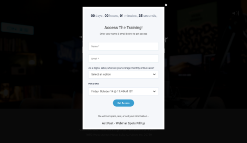
When the user clicks on the CTA button, this lead-capture form shows up. As you can see, the landing page balances the request for signing up for the free training session with the reward of “making $100 with a Digital Product”.
2. Squeeze page
This affiliate marketing landing page is a lot like the lead-capture landing page, in the sense that it is also used to collect data. The difference is that its only purpose is to collect the prospects’ email addresses to add to your mailing list. Squeeze pages are generally used for TOFU (top-of-the-funnel) customers, who are still looking to learn more about a product. These landing pages are usually quite simple, with an impactful headline, minimal content, and a clear CTA (call to action).
Here is a great example of a squeeze page from Miles Beckler. The first thing the visitor sees when opening the page is the headline, which clearly conveys the whole message in just two lines. The design is minimal and the CTA button stands out.

When the visitor clicks on the CTA button, it opens up a pop-up window with a signup form. This is how the squeeze page accomplishes its purpose of collecting the prospect’s email address.

3. Click-through landing page
A click-through page is very different from a lead-generation landing page, as there is no form used to collect the prospects’ information. The purpose of a click-through landing page is to act as an intermediary page between your affiliate offer and the page where your prospects would find the actual product/service. For these kinds of landing pages, you would just have to add a brief description of the product/service the prospect can expect to find by clicking through the page. It should also contain an obvious and bold CTA along with a click-through link.
In this click-through landing page example from Miles Beckler, the most striking thing is the use of color and visuals. The impactful headline+hook are excellent for luring the prospect. The red CTA button also stands out from the blue background and directs the user straight to the website. The value proposition given in the form of points also does its job of describing what the prospect sets to gain from clicking through.

4. Splash page
Splash pages can be used for customers at any point in the sales funnel. These are basic landing pages that come with 1-2 large graphics, minimal copy, and a straightforward message. Splash pages are not designed to generate leads or collect data, but to only present the prospects with relevant information before they move on to the website.
This is a great example of a splash page from Zac Johnson’s website. Even though it is not an affiliate marketing landing page, it is a perfect representation of what a splash page should look like. The graphics have been added in the form of a muted background and the copy is also clear and to the point. When the visitors click on the green CTA button, they’re taken to the page where more information is available on the topic.

5. Microsite
As is evident from the name, a microsite is a small, dedicated website often used by brands for showcasing a campaign, products, or individual events. Microsites can be excellent for affiliate marketers too. It is useful for explaining the details of affiliate offers in greater detail.
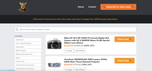
Here is an example of a microsite from DealsViking. The founder (an Amazon Associates partner) created this site to display the discounted offers running on Amazon. With a minimalistic layout and design, this microsite solves the purpose of helping visitors find some great Amazon deals.
6. Sales page
These landing pages are typically used for targeting BOFU (bottom-of-the-funnel) customers, and they are often quite challenging to design. When you create a sales page, you are trying to persuade the prospects to buy a product/service rather than prospecting for leads. It doesn’t rest on a basic request and reward mechanism.
To create an effective sales page, you need to have a better understanding of your customer’s needs at a particular point of the sales cycle. Every little detail, from the design to the copy, has to be handled delicately. You don’t want to end up losing the deal by appearing too aggressive with the sales pitch. At the same time, you don’t want to undersell either. It’s important to strike a balance between both to convince your prospects to make a decision.
Every affiliate marketer knows who Matt Giovanisci is, and this example of a sales page comes from him. The hook line – “Build & Grow a Profitable Blog Without Constantly Second-Guessing Yourself!” – is perfect for a header as it reels in the reader with an impactful message. The design scheme has also been kept minimal, so as to not distract the reader from the sales pitch. The great thing about this landing page is that Matt explains the benefits of the ‘Blog Builder Kit’ by telling his own story of success. This is what we mean when we say that it’s important to strike a balance between underselling or appearing too aggressive.

As the visitor scrolls down the landing page, they are presented with the deal. The CTA button is simple, urging the visitor to buy the kit. Since there are no competing links, there is nothing to distract the visitor either.

7. Viral landing pages
These landing pages are used to build awareness about the brand offering the product. Viral landing pages also link to the brand/product website, but the main focus is to create the page in such a way that it encourages the prospects to share it within their circle. Viral landing pages can contain graphics, written text, and even YouTube affiliate marketing videos.
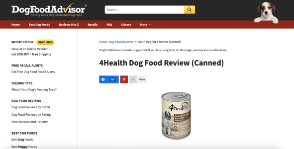
This here is a good example of a viral landing page from DogFoodAdvisor. The simple color scheme and clean layout are good for getting the prospect to focus on the content (a product review). The social sharing buttons make it easier for prospects to follow and share the page within their circle, and also show how many followers the page already has.
8. Infomercial
When you think of infomercials, probably the first thing that comes to mind are the television advertisements from the 90s. But digital infomercials are quite different from these. These are long-form landing pages that weave an intricate story around the product/service on offer. The purpose of the digital infomercial pages is to keep the readers hooked, ultimately convincing them to make the purchase.
Here is an example of an infomercial page, again by Matt Giovanisci. It starts off with a great headline that explains to the reader what they can gain from using Asana. He then goes on to explain how using Asana has helped him manage his blog.

As you can see, this is a long-form landing page, in which the marketer explains the benefits of the product in depth.

Matt also includes some customer testimonials to build social proof for the product.
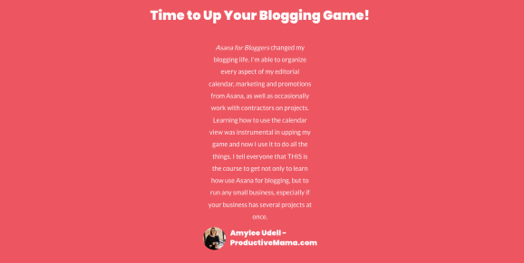
At the end of the page, he shares his deal with a CTA button encouraging visitors to make the purchase.

What is the best way to create landing pages for affiliate marketing? Useful Tips for Affiliate Marketers
1. Start with a captivating headline & hook
When a visitor lands on your affiliate landing page, the first thing they’ll come across is your headline. This is what will prevent the visitors from bouncing off the landing page straight away. You need to ensure that the headline captures their attention, clearly states your idea, and makes them curious about the affiliate product/service you’re offering. The header (or even the subheads) needs to be crafted in such a way that it compels them to scroll down and click the CTA button. Generate curiosity, intrigue, fear of losing out, or a sense of urgency with your headline.
Tools to use: Narrato AI headlines generator

2. Design the landing page with appealing visuals and videos
Enticing visuals are always great for making an impact on the audience. The primary image or video you’ve added to the landing page needs to hold the attention of the visitor. Choose these visuals carefully according to the theme of the marketing campaign. Make sure that the visuals do not crowd the landing page. The goal is to keep the landing page design simple, appealing, and without many distractions. A better way to engage your visitors is by adding a short affiliate marketing video showing the affiliate product/service in action.
Tools to use: Narrato AI image generator, Canva, and Invideo
3. Keep the copy simple and clear
After adding the headline and visuals, it’s time to move to the copy. This is where your marketing message goes in. Your copy needs to accomplish two things – it has to resonate with the target audience and encourage them to scroll down further. To do this, you need to keep your copy short (ideally), clear, and to the point. The problem with longer copies is that they are not as effective in holding the prospect’s attention. Make sure that you explain your offer and the benefits of the product/service clearly and concisely.
Tools to use: Narrato AI writing assistant
4. Call to action
One of the most important parts of the affiliate landing page is the call to action. When your visitors arrive here, you want to make sure that there is a direct and clear CTA button that encourages them to take the next step. The key is to make the CTA as easy as possible, attention-grabbing, and without any secondary links to distract the visitors.
Tools to use: Narrato AI Call to Action generator
5. Include testimonials and social proof
You can also include customer testimonials, endorsements, and reviews as social proof for an affiliate product/service. The audience is more likely to make a purchase when they see recommendations coming from people they can trust. If this social proof can encourage your visitors to take an action, then including them on your affiliate landing page is certainly worth a shot.
Affiliate landing page example
Here’s an example of a perfect landing page from Kim Snider of ReverseYourFunnel for a webinar. This is what an ideal landing page should look like –

Wrapping up
At the end of the day, creating an affiliate marketing landing page all comes down to –
1. Understanding the interests, needs, and demographics of the audience.
2. Effectively communicating to them what they’ll get out of the offer.
A successful affiliate marketer is one who has a fine grasp of what makes the audience tick. Only then will you be able to craft the right benefit statement on your landing page.
The affiliate marketing landing page examples and best practices given in this article will hopefully give you the right direction when you are creating your own landing pages. Take a look at this blog on common affiliate content marketing mistakes to avoid making any similar mistakes in your campaigns.
For more resources on affiliate marketing and trends dominating the industry, follow the Narrato blog.


